Food Art That Fights AIDS: Meet Danielle Evans
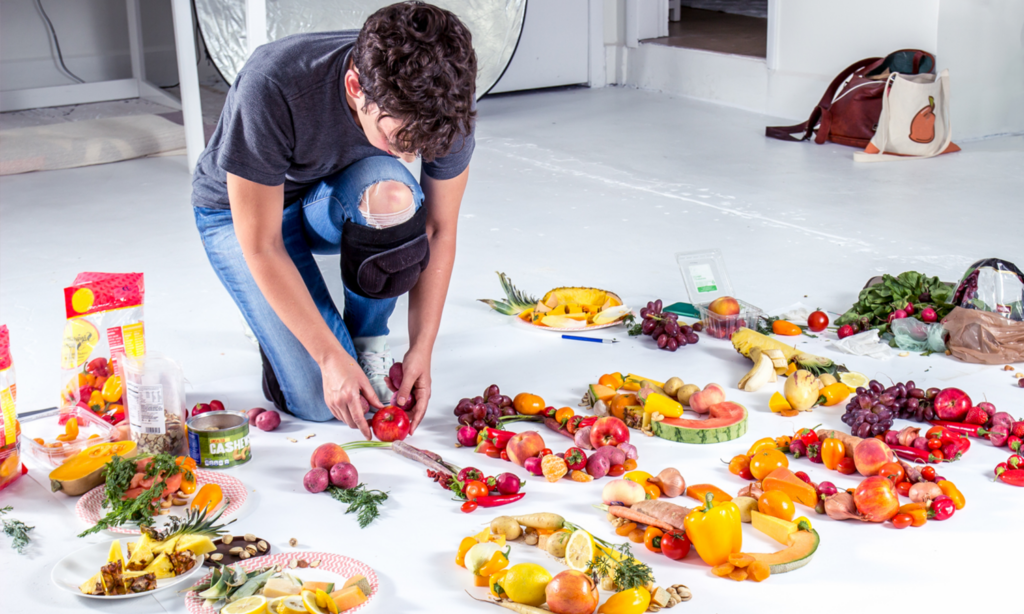
They say you eat first with your eyes, so naturally when EAT (RED) SAVE LIVES rolled around last June, (RED) knew just the person to partner with for inspiring, striking, and downright fun artwork.
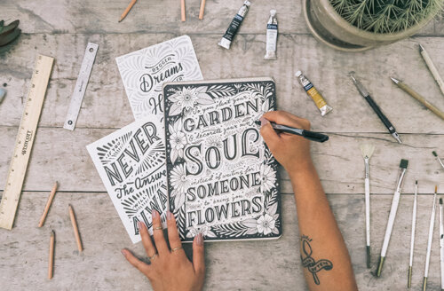
Her name is Danielle Evans, but you might recognize more for her Instagram moniker @marmaladebleue. Her account, which has over 15,000 followers, showcases some of the most interesting visuals online, mostly revolving around two of the internet’s most crazed-over topics: typography and gastronomy. It’s a recipe that everyone everywhere can enjoy.
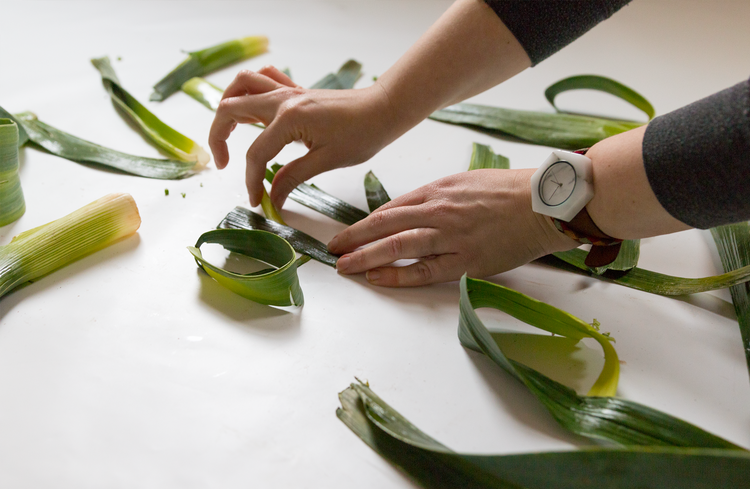
We believe in the power of creativity to fight AIDS — and are always inspired by people pushing their artistic boundaries to support (RED). That’s why we spoke with Danielle to discuss the inspiration behind her work, find out her favorite certain-colored foods, and reflect on why her partnership with (RED) is so important.
(RED):
How did you first get into typography?
Danielle Evans:
I went to school for illustration where I learned how to develop a narrative but also discovered I wasn’t much of a painter or character illustrator. During late junior year, I took my first typography class and fell in love with letterforms. Unlike pictorial images that can be conceptually vague, typographic illustrations are more direct in their message. After a brief Internet search, I learned drawn typography was called lettering. This was perfect for me, save all the digital outputs. Many of my peers succeeding in this world (Jessica Hische, Jon Contino, Dan Cassaro, Erik Marinovich) were popularizing hand drawn lettering scanned into the computer and digitally tweaked to perfection. Admittedly I was too sloppy to adopt this level of work.
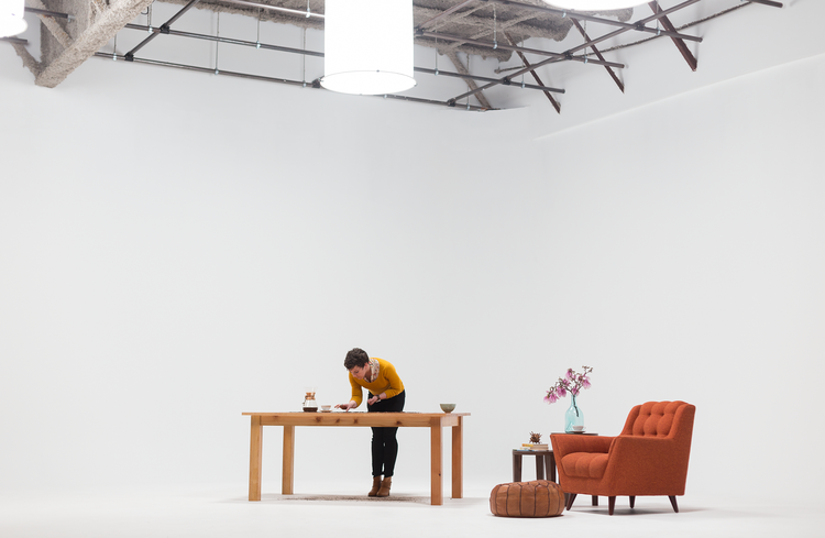
I offhandedly told a friend that I wanted my work to jump off the page and evoke multi-sensory experiences. I had been drinking a cup of coffee and explained that experience is as much about the heat from the cup and the aroma of the bean as it is the taste on my tongue. She literally encouraged me to make lettering out of coffee, and the rest is history. We imbue the world around us with purpose and memories merely by existing, so these items began speaking to me through the lens of my art.
(RED):
Why food typography?
DE:
First of all, eating is a shared human experience. Not everyone has painted or sculpted, but everyone has eaten. Food is political, comforting, temporal, and evocative, sometimes simultaneously. I loved how words convey inherent meanings; multiple messages are possible in one word. Add an additional layer of the meanings nestled in our food, which can play towards or against the overall concept in a way pen and paper fail to do.
I began realizing each item tended towards loopier scripts or slabby serifs; they had their own voices. Some items feel more elegant, sloppy, crisp. Event the space around letterforms can eloquently speak to the concept.
Skillfully building these layers is like identifying a flavor profile: which is primary, which lingers on your tongue? If you chew on the idea for a bit, does another idea emerge? These layers give body and purpose to the image in a way other mediums simply cannot.
(RED):
What’s your favorite red-colored food that you’ve worked with?
DE:
Bacon is a favorite, personally, especially with the striping. Making animal products feel alive is so difficult, and the strips have so much energy depending on how they’re cooked. I love how high-quality cuts hold their shape while cooking, and of course the smell can’t be beaten. The crackling is a minor occupational hazard if you pan fry your letters, but I recommend baking!
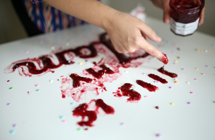
I’m also a fan of sauce because it can feel lumpy and round or quick and energetic. I tend to prefer a good drip or something that makes the best use of the weight!
(RED):
Why did you want to work with (RED)?
DE:
I have friends grappling with very serious STDs, and (RED) aligned with this concern directly. I’d love to see them find relief, have positive sexual experiences, and see prioritized research to alleviate their suffering. Secondarily, (RED) has been at the forefront of consumer activism for at least fifteen years. It was the first time that I felt , a young teen at the time, that I could make a larger difference with something as simple as my t-shirt purchase. Empowering people to consider how and why they own, eat, and participate in the world outside of themselves is a huge deal, one for which I’m honored to contribute.
(RED):
How can entrepreneurs and artists like yourself use their work for good?
DE:
I think the onus is on creators to make work that motivates, whether study, action, or purchase. I make plenty of inspiring work, but inspiration is a one-sided endeavor. Someone can receive tingles or warm fuzzies when looking at images I’ve made, but aside from this reaction, the encounter is empty. Motivating a viewer means they ingested your work and used the ideas as fuel to touch someone else’s life.
I used to avoid controversy in my work, stating “Food Unites,” but the adverse of this is also true: Food Divides. It’s my responsibility to visually explore the spectrum of these ideas. I like to think art is the exploration of truth, and I’m constantly searching for the alignment between my values and those of my clients. The more aligned, the more powerful the message.
